
Role: Creative Director
—
Creative Direction: André Porto Alegre
Graphic & Digital Design: André Porto Alegre & Schutz US Team
Photography: Lufree
Film: Gui Yoshida
Model: Naitiele, Marie Helene & Tissiane
Set Designer: Jean Labanca
Styling: Fabiana Leite
Beauty: Paula Kajia
Still Photography: Muccio Ricardo
Executive Production: Bravva Produções
Still Photography Assistance: Ana
Styling Assistance: Matheus Foc
Retouch: Telha Criativa
━ the boldest heat ━ the boldest heat ━ the boldest heat━ the boldest heat ━ the boldest heat ━ the boldest heat
━ the boldest heat ━ the boldest heat ━ the boldest heat━ the boldest heat ━ the boldest heat ━ the boldest heat
Schutz US:
High Summer 24
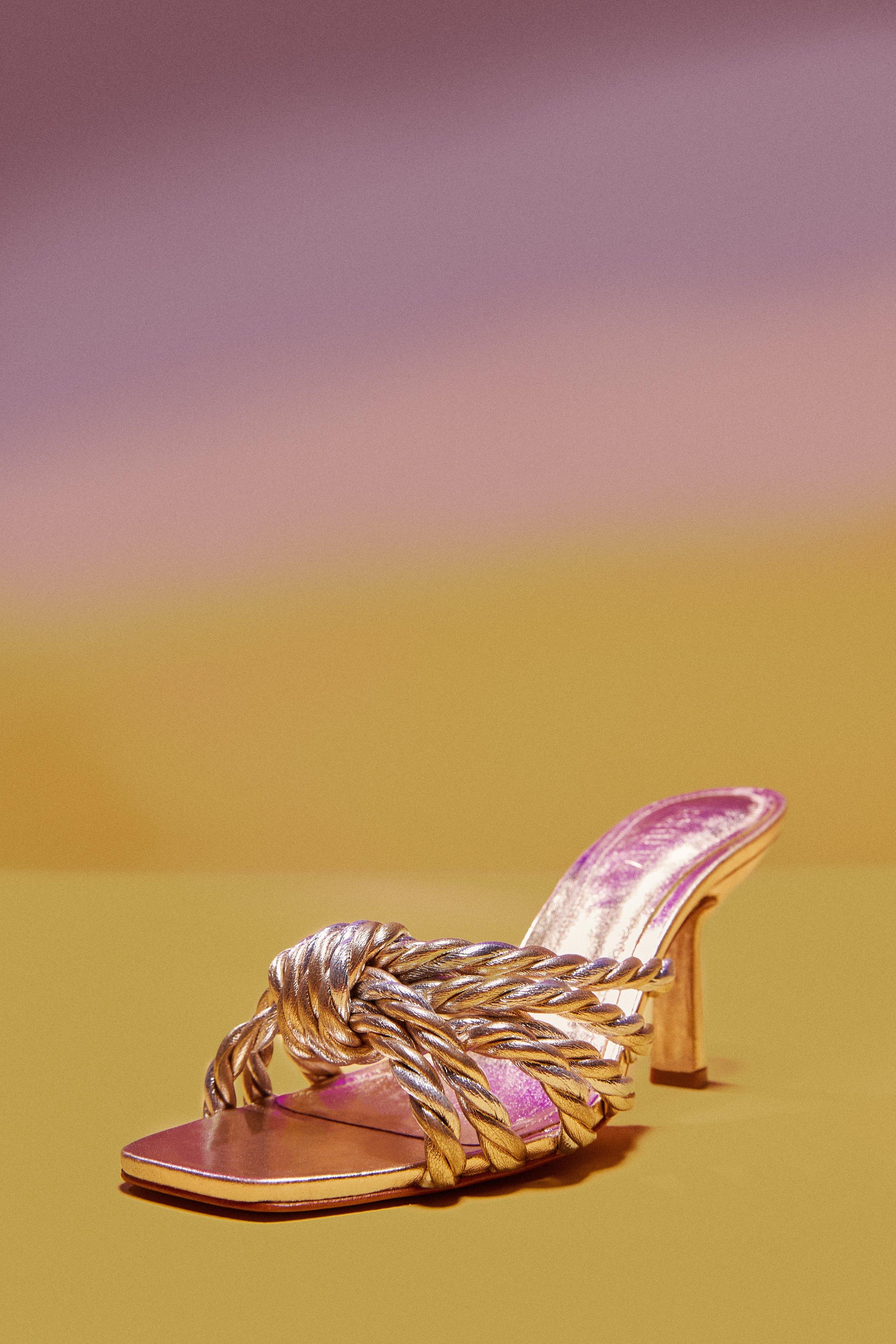
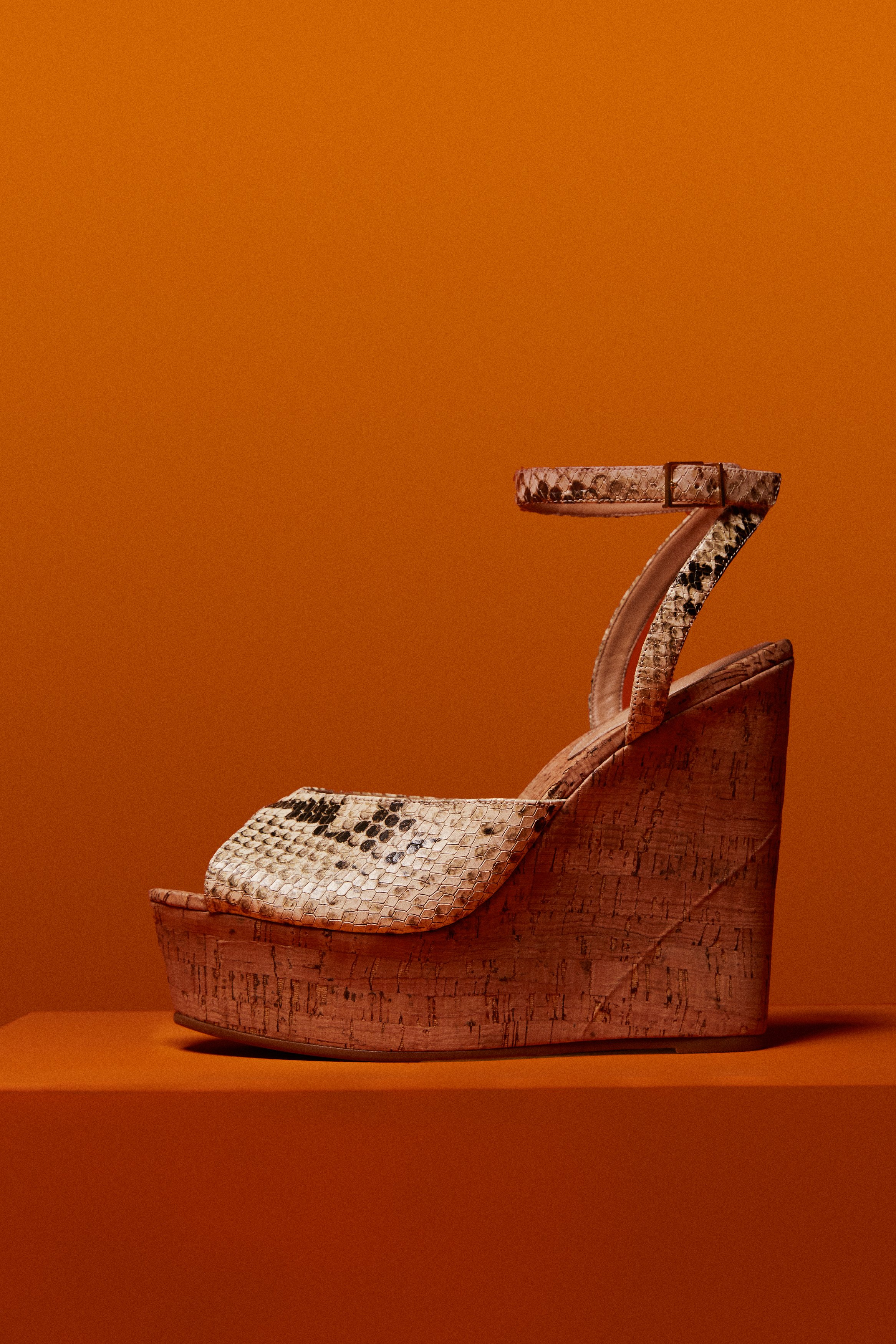
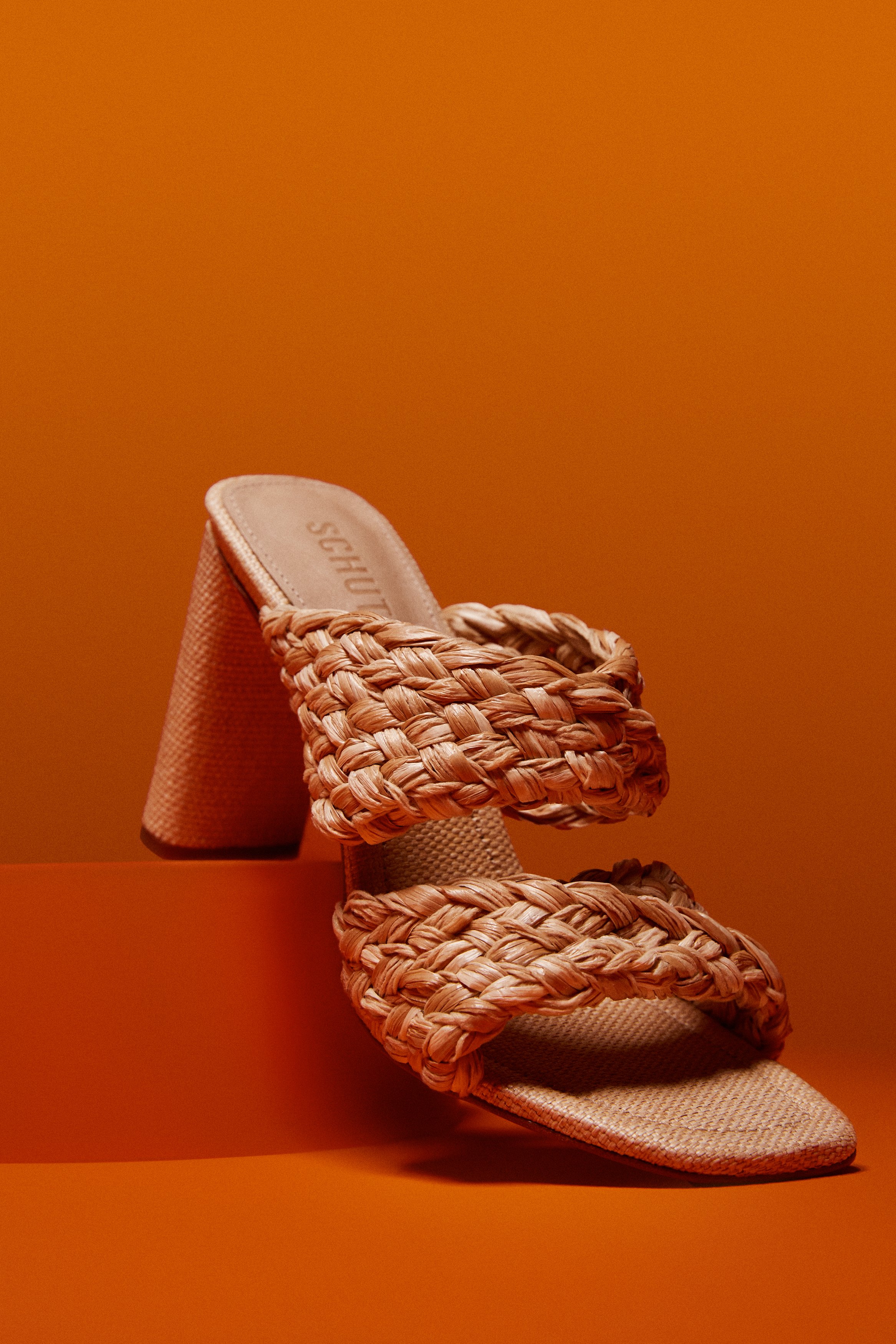
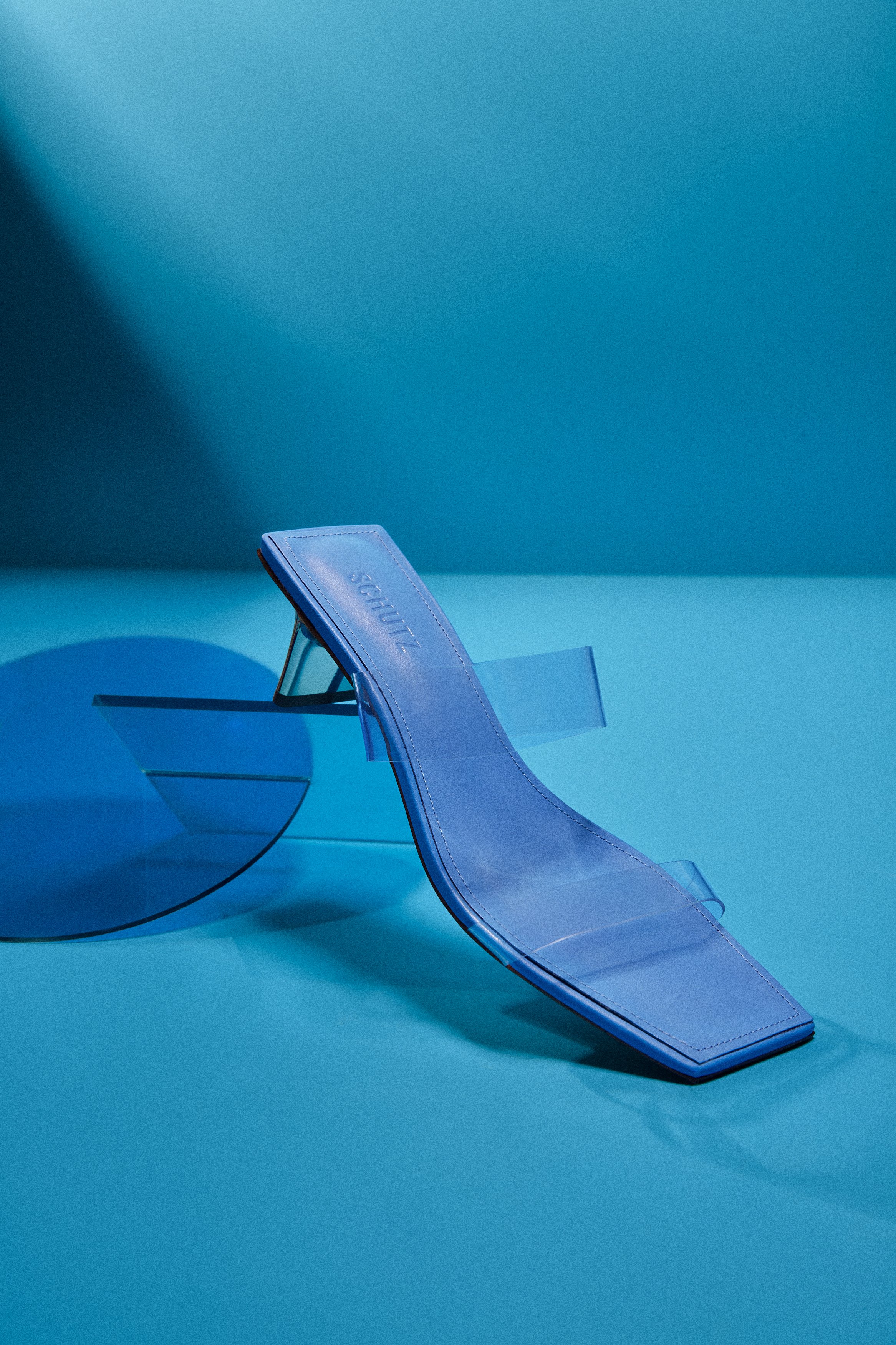
In this captivating video for Schutz US’s high summer campaign, three moods come to life, each set against a unique backdrop that enhances its vibe. The first mood, "sunset," is showcased with a stunning gradient backdrop, blending rich shades of yellow and purple, reminiscent of a perfect evening sky. Moving into the "natural" mood, the set features a vibrant orange background, bringing warmth and energy to the scene, reflecting the vitality of summer. Finally, the "wet" mood takes us to a cool, refreshing world, with a water mirror reflecting the models' movements, paired with a serene sky blue background, creating a tranquil and refreshing atmosphere. These distinct sets bring each mood to life, perfectly capturing the essence of summer and Schutz's bold, stylish vision.


Campaign Film
The high summer campaign for Schutz US delivered a stunning visual experience, showcasing three distinct moods: sunset, natural, and wet. Each mood captured the essence of summer in a unique way. The "sunset" mood bathed the models in warm, golden tones, evoking the beauty of evening skies. The "natural" vibe embraced earthy textures and organic elements, highlighting effortless, carefree elegance. Finally, the "wet" mood brought a cool, refreshing feel, with glistening water that accentuated the vibrancy of the season, perfectly embodying the spirit of summer and the brand's bold, fashionable flair.
Still Images
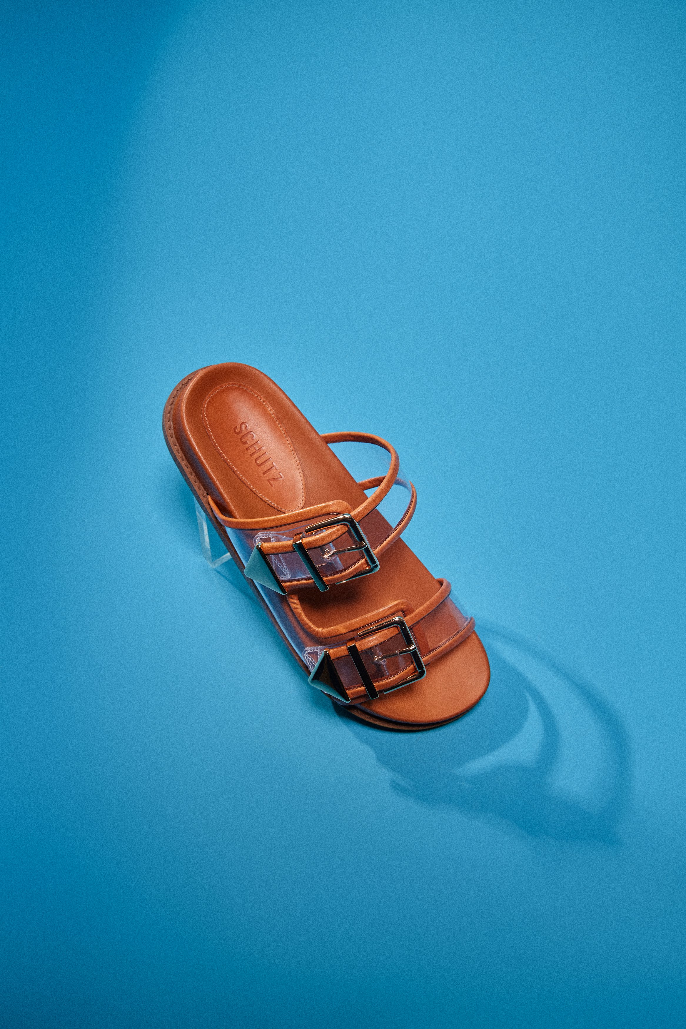
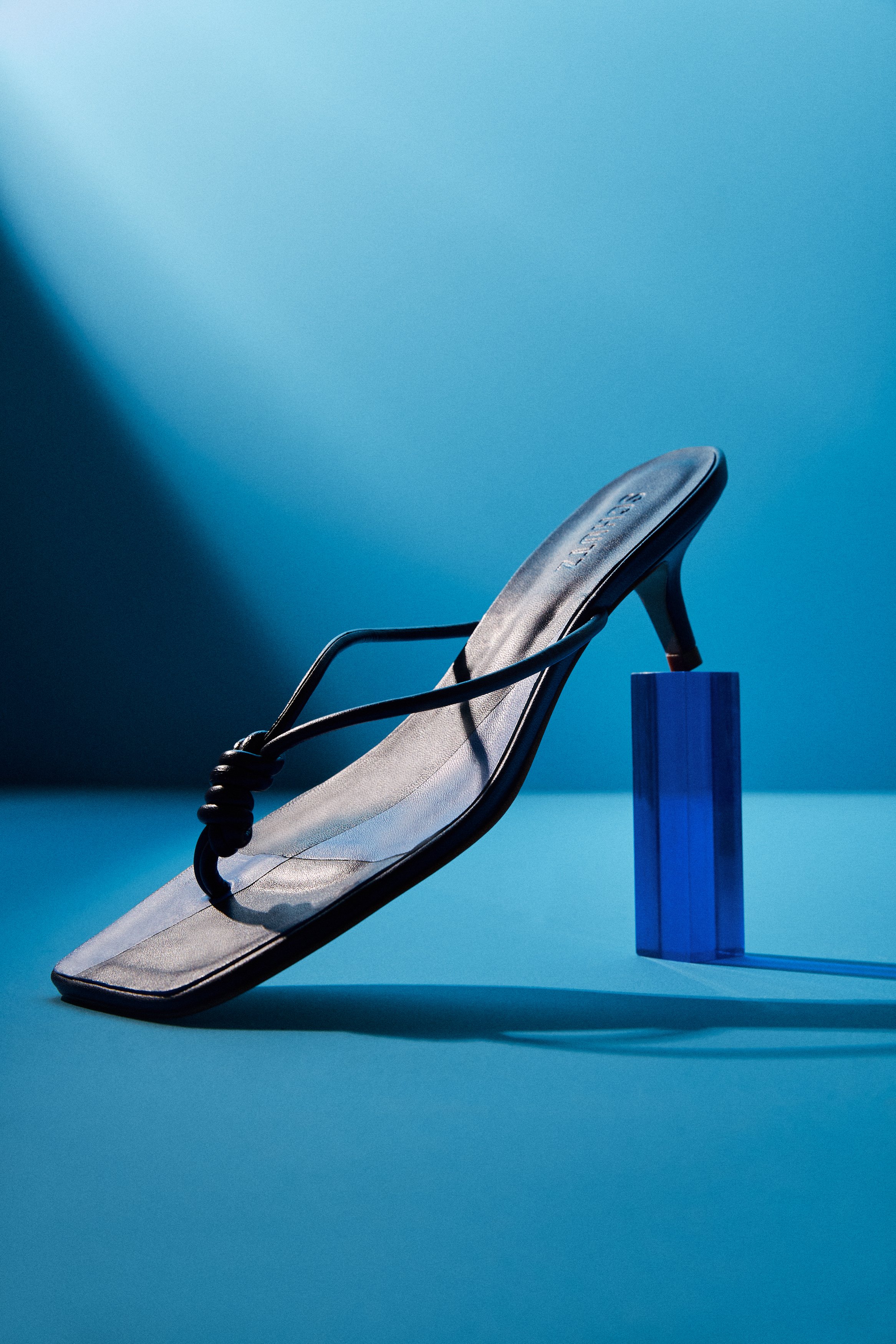
The still life images of the shoes from Schutz's high summer campaign beautifully highlight the intricate details and design of each pair. Set against minimalist backdrops, the shoes take center stage, with light and shadow enhancing their sleek lines, vibrant colors, and textures. Each image captures the essence of summer, from bold heels to casual sandals, showcasing how these statement pieces elevate any look with effortless style and sophistication.



Visual Identity
The key visuals of Schutz’s high summer campaign embody a sleek, minimalist approach, allowing the product to truly shine. The use of the logo and typography is subtle yet impactful, with the logo strategically placed to maintain the focus on the shoes. The clean, modern typography complements the effortless elegance of the campaign, creating a balanced and refined visual identity. This minimalist design philosophy allows the vibrant moods and stunning footwear to take center stage, reinforcing the brand's chic and sophisticated aesthetic while ensuring the campaign feels fresh and timeless.


Branded Material (Physical & Digital)
The online and printed materials for Schutz's high summer campaign seamlessly blend digital and physical realms, offering a cohesive brand experience. Online, the campaign shines with dynamic visuals across social media and the brand’s website, capturing the vibrant energy of the campaign with interactive, eye-catching content. Printed materials, including lookbooks and posters, bring the same bold aesthetic to life with high-quality imagery and sleek design. Both formats use minimalist typography and subtle branding, ensuring the focus remains on the stunning shoes and the mood-driven sets, creating a harmonious and immersive experience across all touchpoints.


