Role: Creative Director
—
Creative Direction: André Porto Alegre
Graphic & Digital Design: André Porto Alegre
Photography: Lufreé
Film: Eduardo Ohara
Model: Pilar Mujica
Set Designer: Jean Labanca
Styling: Fabiana Leite
Beauty: Angel
Still Photography: Chico
Executive Production: Index
Still Photography Assistance: Ana
Styling Assistance: Matheus Foc
Retouch: Telha
━ lush tint ━ lush tint ━ lush tint ━ lush tint ━ lush tint ━ lush tint
━ lush tint ━ lush tint ━ lush tint ━ lush tint ━ lush tint ━ lush tint
Schutz: Casual Cool Spring | Summer 25
The Casual Cool campaign was a natural extension of Schutz’s Summer 25 narrative—continuing the exploration of red as a symbol of presence, energy, and modern femininity. As part of the broader “Red Takeover” vision, this chapter translated the boldness of red into a more playful, effortless aesthetic, while maintaining a high level of sophistication in every visual element. At the heart of the set design was a giant red wall, constructed from a bright, cylindrical-format upholstery that brought an unexpected texture and architectural depth to the campaign. This oversized, sculptural backdrop functioned as both a design statement and a visual anchor, allowing the products—shoes, bags, and accessories—to pop while reinforcing the dominance of red in the brand’s summer storytelling.


Campaign Film
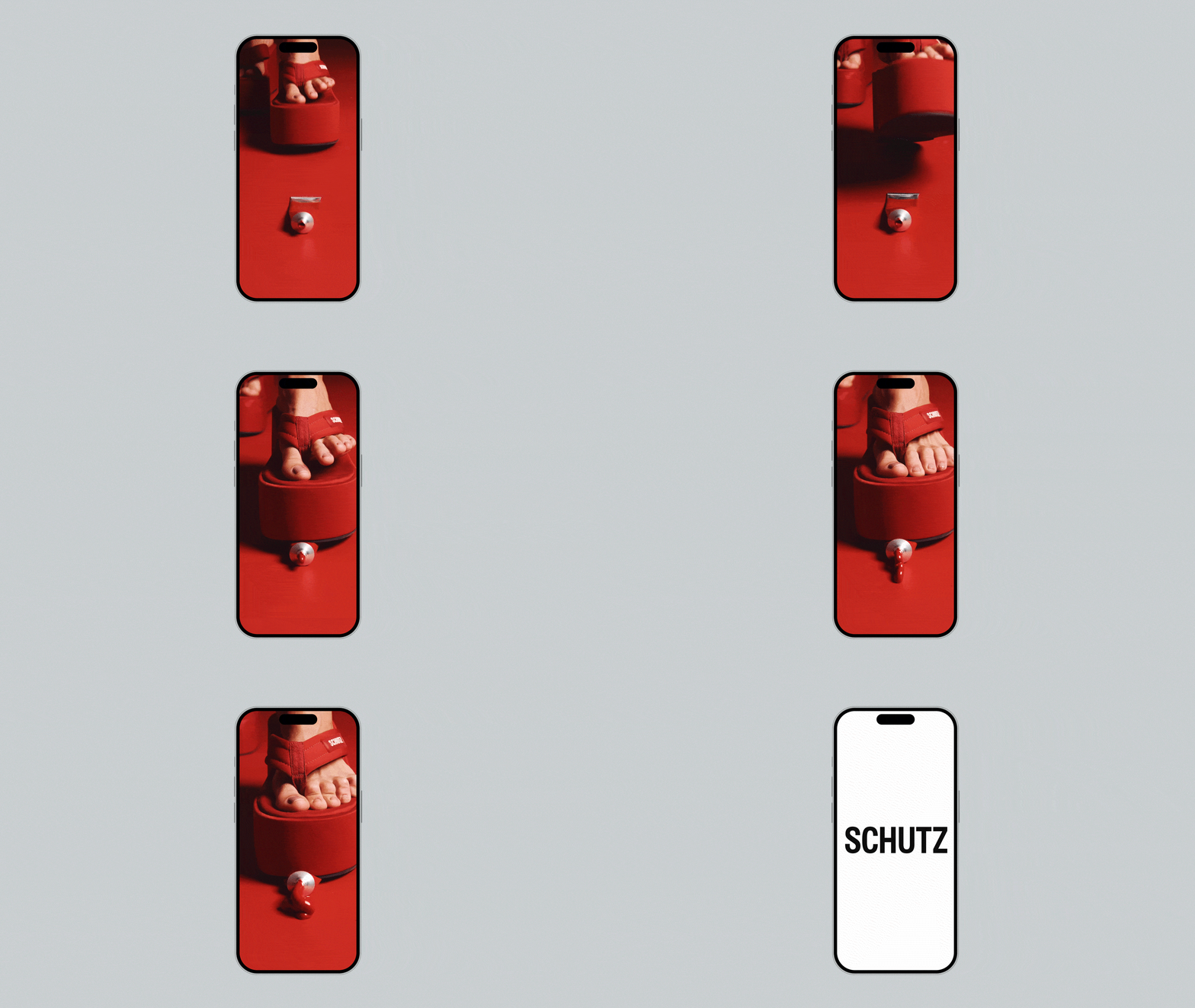
The Casual Cool campaign film brought a modern, elevated aesthetic to life through fluid motion, striking composition, and bold visual contrasts. Designed as a seamless extension of the still imagery, the film showcased the collection in an editorial yet accessible way—placing Schutz shoes and accessories at the center of a minimalist, color-saturated world. The hero set piece, a sculptural red wall made of cylindrical upholstered panels, provided both texture and depth, acting as a dynamic stage for the model’s movements. Intimate close-ups focused on footwork and accessories, often framed through a translucent red acrylic prop that added layers of abstraction and visual intrigue. Subtle camera movements and a cool, rhythmic soundtrack helped establish a refined, confident mood—effortlessly blending casual styling with high-fashion energy. The result is a modern visual piece that captures the spirit of Schutz: bold, contemporary, and unapologetically stylish.
Still Images
The still images are bold, editorial, and meticulously composed to capture the power of red in its most iconic form. Each photograph was designed to feel like a visual statement—where styling, composition, and lighting work together to convey strength, sensuality, and confidence. Set against minimal yet striking backdrops, the use of red as a dominant color—whether in garments, accessories, or lighting—creates a cohesive and immersive visual language. The imagery blends fashion-forward poses with cinematic framing, evoking both sophistication and energy. These stills not only highlight the product with precision and allure but also serve as key brand assets, reinforcing Schutz’s identity as a fearless and fashion-driven label.


Visual Identity
To further elevate the concept, we introduced a red-tinted acrylic prop—used in a series of foot-focused images that highlighted the shoes with striking clarity and contemporary framing. This minimalist approach, combined with the rich color palette and precise lighting, created a strong visual contrast and helped direct attention to the core products in a fresh, elevated way. The visual identity of the Casual Cool campaign was designed to be bold, modern, and instantly recognizable. A key element of the branding was the oversized use of the Schutz logo, applied in a large scale across both still and motion assets to create visual impact and reinforce brand presence. The logo acted not just as a signature, but as an integral design element—anchoring layouts with strength and confidence. Complementing this, the collection title and season tag, “Casual Cool – Summer 25”, was consistently placed at the bottom of visuals in clean, minimalist typography. This hierarchy allowed the product and creative concept to lead, while grounding the campaign with clear seasonal context. The result was a cohesive and elevated identity system that seamlessly connected campaign visuals across digital, print, and in-store channels.


Branded Material (Physical & Digital)
To ensure a cohesive and impactful brand presence, a complete suite of branded materials was developed for both online and offline channels. Digitally, the campaign was brought to life through animated assets, social media content, paid media banners, email marketing templates, and a full e-commerce takeover—each designed to reflect the bold visual language. Offline, the campaign extended into high-impact visual merchandising, including window displays, in-store signage, printed lookbooks, and campaign cards used across over 90 retail locations in Brazil and 2 flagship stores in the U.S. All materials were built around a modular design system, ensuring consistency in brand storytelling while allowing for strategic adaptation across platforms and regions. This 360° approach not only elevated the customer experience but also reinforced Schutz’s bold, fashion-forward identity at every consumer touchpoint.


